Unleashing a Smoother Experience with Enhanced Filters and Navigation
Introducing further improvements to the filters, menu, and navigation in the dashboard!
Our aim is to constantly improve the user experience and make it easier for you to access the information you need.
The filters bar has been optimized to provide greater clarity, while the menu and navigation panes have been streamlined to make it easier to find your way around the platform.
Filters
Our goal is to strike a balance between providing clear and comprehensive information about filter applicability while preserving valuable real estate on the page.
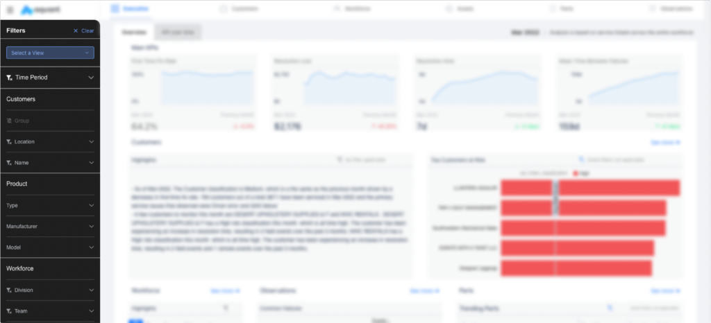
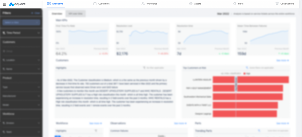
To optimize the page layout, we have relocated the filters bar to the left-hand panel, giving users a clear view of the charts within and enabling them to concentrate on gaining insights. This adjustment prioritizes the most important aspect of the platform, which is providing valuable insights.
Furthermore, we have added clear disabled states to indicate when filters are inactive due to missing data or are not applicable on the current page.
Navigation and Menu
We have also enhanced the overall navigation experience by moving the left-hand vertical menu to a horizontal navigation bar that stays fixed to the top of the page while scrolling. This makes it easier for users to stay oriented and know exactly where they are at all times.
This new navigation bar has been enriched with a hamburger menu, allowing us to provide access to all Service Insights resources, including the release notes platform, the feedback form, and a soon-to-be-added glossary.
A Fresh Perspective on Measuring Success: KPI Reshaping
Breaking Down Barriers: The Journey to Plain Language
Your feedback regarding the challenges of our terminology and the need for frequent training for your colleagues has been heard and understood.
We are committed to improving the accessibility and comprehensibility of the information we present to our users. To support this goal, we have made the decision to adopt plain language in the terminology used for key performance indicators (KPIs) on our dashboard. This change is intended to make information more accessible to a wider audience and to enhance comprehension for all users.
Specifically, we have replaced the following terms:
- First Time Fix replaces "FTF"
- Resolution Cost replaces "CPS"
- Resolution Time replaces "MTTR"
- Time Between Visits replaces "MTBV"
It is important to note that the underlying calculations for these KPIs have not changed, only the terminology used to describe them.
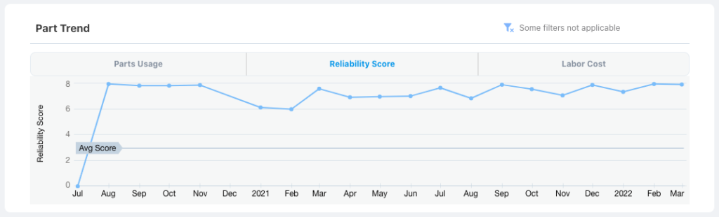
Bringing Closer to the Field: Improving the Part Reliability Model
The Part Reliability model was designed to provide insight into the performance of individual components and determine the effects of environmental factors or customer misuse.
To further refine the model, research was conducted based on customer feedback, which led to important updates. The model now relies on the number of replacements per asset, instead of the Mean Time Between Failures (MTBF), as a more accurate reflection of the field's reality. This change provides a clearer and more precise understanding of the components' reliability, enabling organizations to make informed decisions about maintenance and replacement needs.
The updated Part Reliability model represents a significant step forward in the assessment of component reliability and is a valuable tool for organizations looking to maintain the health and performance of their assets.
Enhancing Customer Risk Prediction through Improved Classification Model
The Customer Risk Classification model has undergone significant improvements to ensure better reflection of the potential for customer escalation in the near future. The model continues to rely on key performance indicators (KPIs) as important factors, but now also takes into account the correlation between customer risk and asset performance.
By incorporating this additional insight, the model can provide a more comprehensive evaluation of customer risk.
Additionally, the model has been designed to place more emphasis on recent events, recognizing their greater impact on the customer experience and overall risk assessment.
The result is a more accurate and robust tool for predicting customer escalation and managing risk.
Improving Insights through Additional Options
Enhancing Workforce and Asset Analysis for Improved Performance
In recent months, we have added cohorts to the Workforce page to provide a comprehensive view of workforce performance. With this release, we have taken it a step further by enabling new team-level analysis.
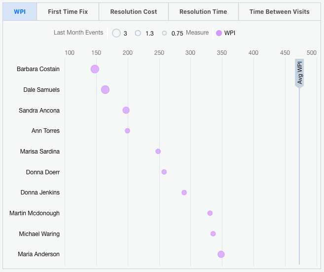
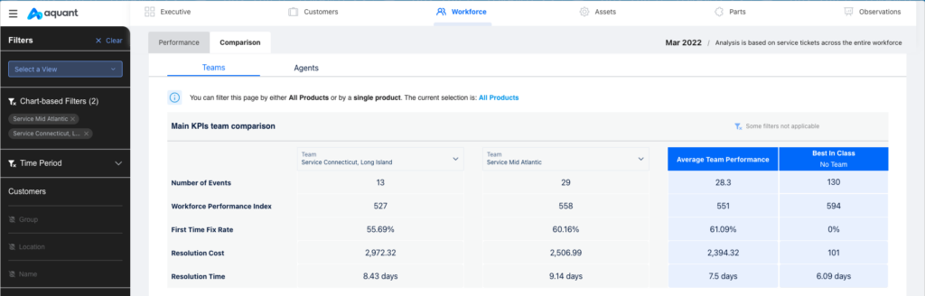
Enhanced Team Performance Comparison
Comparing the performance of one agent to another, to the company average, and to best-in-class performance offers valuable insights for identifying training opportunities or preparing for one-on-one meetings with technicians. This granular level of analysis enables a better assessment of technicians' performance. To go a step further and provide a view of performance at a higher level, we have also added the ability to compare teams.
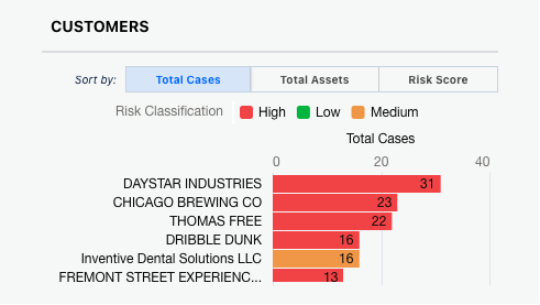
Comprehensive Customer Understanding through Multi-Factor Analysis
A single parameter is not enough to provide a complete understanding of performance. As a result of our customers sharing their use cases and highlighting the need for multiple perspectives, we have improved the Customers chart on the Workforce page to incorporate analysis based on multiple factors, including risk score, total cases, and total assets.
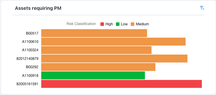
Preventative Maintenance for Specific Teams
When visiting the Assets page, users typically want to determine which assets are at risk and could benefit from preventative maintenance. By combining these analyses with a breakdown of the workforce, it highlights how training can impact asset health and prevent customer escalations. To support this analysis, we have added a filter option that allows you to see assets that require preventative maintenance for a specific team.
Unlocking Insights through Customization Options
The addition of filters for visualizations greatly expands the insights available by offering various perspectives and layers of analysis. A single viewpoint is never sufficient to fully understand the complexity of the field and the challenges faced by your team. To address this, we have incorporated new customization options such as:
- Adding custom data to the reference table for quick answers to questions and evaluation of events without returning to the source. This could include information about contracts, warranties, etc.
- Defining windows to calculate the Workforce Performance Index.
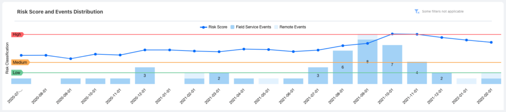
Risk Classification and Trend Analysis for Improved Customer Insights
Ultimately, clear visualizations lie at the core of our mission, as they shape the way insights are communicated. In our previous release, we introduced risk classification for Customers and Assets, replacing scores with a three-level classification system. This allows for a quick understanding of the level of urgency associated with Customers and/or Assets. To further support this effort, we have refined the Risk Score and Events Distribution chart on the Customers page, emphasizing the risk trend over time in relation to the low, medium, and high thresholds defined for each customer.
We are confident that these improvements will enable users to make more informed decisions and drive better outcomes.
Want to learn more?
Watch our webinar, dedicated to this new version!
Any feedback on our new releases?
Please feel free to reach out to us and we’ll set up a Q&A session along with your Customer Success Manager.